DaaS GROUP


DaaS Group is a newly established company aimed to implement its sales engineering method to any business model.

The starting challenge of this project was that we had to communicate a new form of business, so we chose to integrate an illustration in an audiovisual montage that, in a very schematic and visual way, showed the activity and the problems that DaaS Group solves in companies.

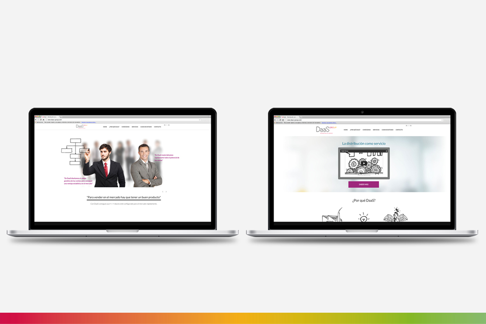
This video is the leitmotif of the web page development, with a simple look, effective, ‘scrollable’, with a white background in which the explanation of the business model and the call to action prevails over.

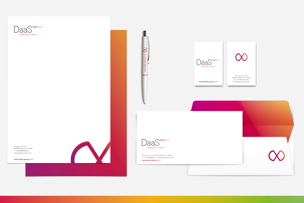
We also developed their logo and its different applications, in which the textual part comes from the initials of its claim ‘Distribution as a Service’: DaaS Group. We chose Bireun for the typography, very personal and with a technological character. We took the S from the typography to generate a symbol that simulates the infinite, to communicate the wide range of possibilities that the services from DaaS Group offers. Furthermore, the use of gradients in a part of the logo and the combination of warm chromatic ranges for different versions of it, gives that touch of versatility that we believe was the most convenient.

This video is the leitmotif of the web page development, with a simple look, effective, ‘scrollable’, with a white background in which the explanation of the business model and the call to action prevails over.
We also developed their logo and its different applications, in which the textual part comes from the initials of its claim ‘Distribution as a Service’: DaaS Group.

We had to communicate a new form of business, so we chose to integrate an illustration in an audiovisual montage that, in a very schematic and visual way, showed the activity and the problems that DaaS Group solves in companies.