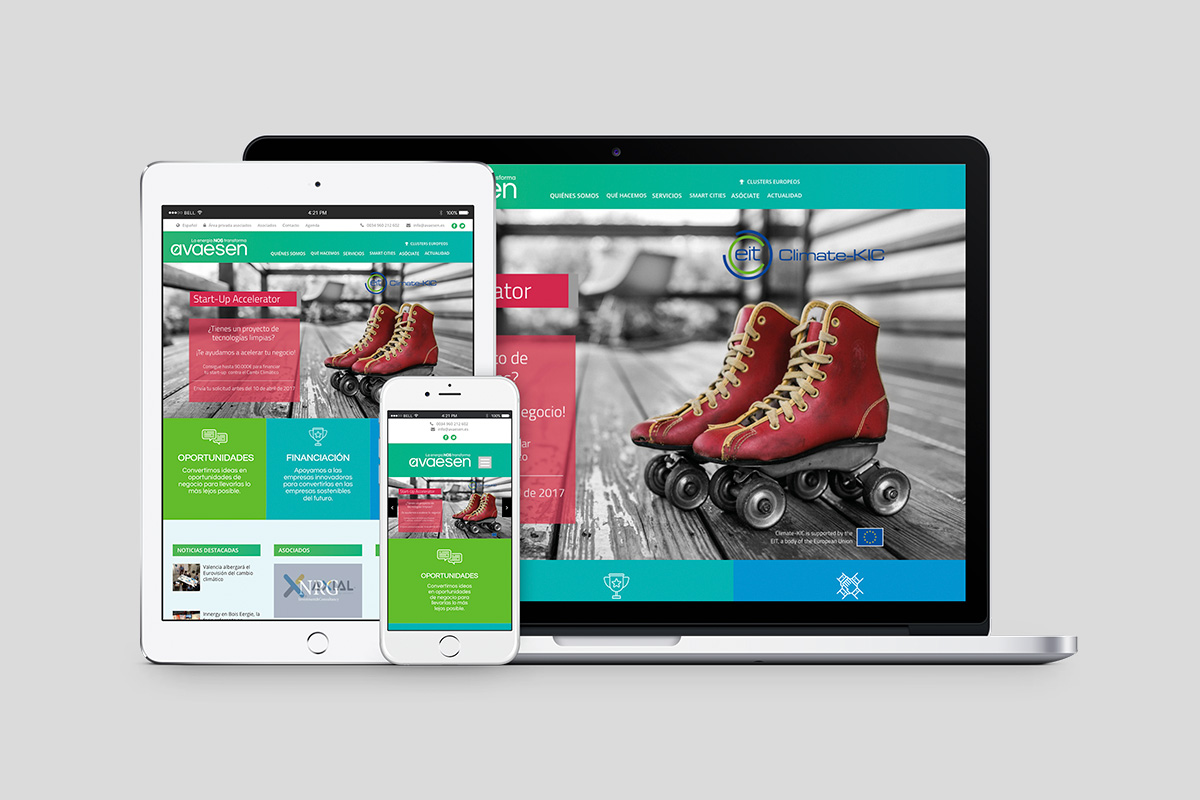
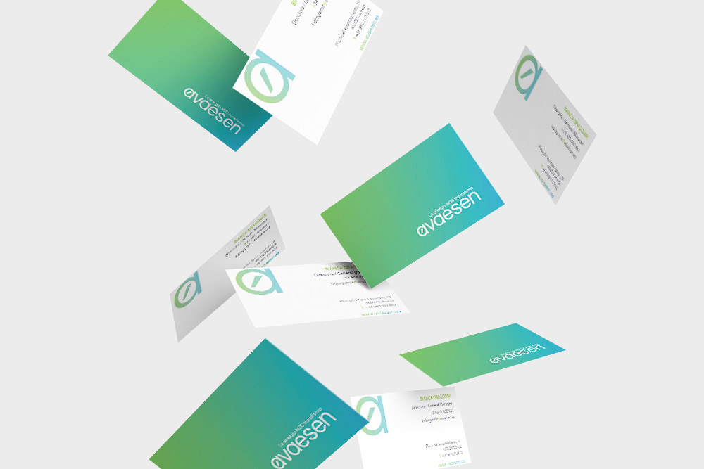
The Valencian Association of Companies in the Energy field (AVAESEN) trusted äbranding for the restyling of their logo and corporate image, as well as for the development of their corporate website and other media elements.
The starting point for the brand redesign was to use different color ranges associated with the renewable energy and nature field. In this way, greens and blues are the protagonists, using as well different gradients. The chosen typography, Questrial, evokes organic forms and it is friendly. The diacritical mark from the old logo was kept, leaving a bond with the new one.
For the corporate website, we integrated a clean and modern design in which the chromatics of the brand predominate, transmitting innovation, energy and technology. In addition, we achieved a more sophisticated appearance, different from other associations, through more direct messages and with content integration that connects directly with associates and other agents from the field.
We also worked with AVAESEN to design their email marketing communication campaigns, mainly for the announcement of their annual events that they usually organize: Climaval, Climate KIC Accelerator, Climate Launchpad and Think Tank.

The typography chosen for the new brand was Questrial. This typo is very friendly and close when it is used, and it evokes more organic forms.


