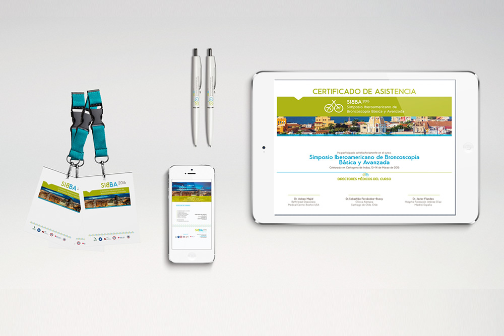
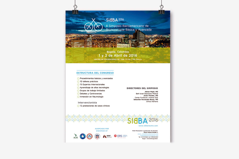
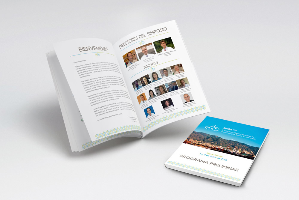
For the third consecutive year we have made SIBBA’s entire graphic material, the Latin American Symposium on Basic and Advanced bronchoscopy. This act gathered the best pneumology experts from Europe and Latin America to share the latest medical progresses and new techniques of this field.
SIBBA asked us to develop their corporate identity and their website.
The identifier icon is the stronger element in the visual identity of this project. If we look at the symbol you can see that is lung-shaped, but if we turn it around, it has the shape of a tree. The meaning of this logo is to represent the lungs need for fresh air created by nature.
Also, to meet the same goal, we chose green and blue colors, which evoke nature and health, respectively.
In addition, the anagram generates comments and gives a visual impact. The logo was used to create frames that have been used both in the graphic elements for the Congress (accreditations, totems, program, etc.) and for the web.
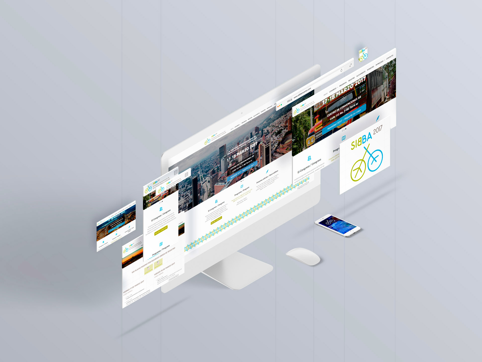
In äbranding we developed the web page with an informational structure to highlight the impact of the events internationalization.
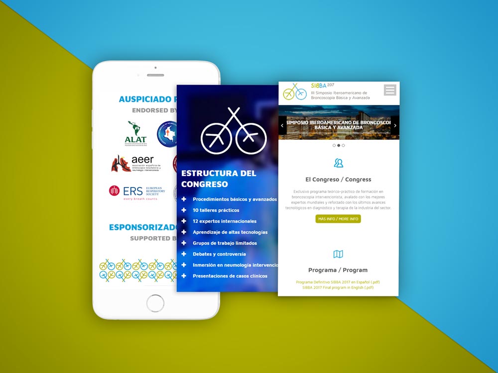
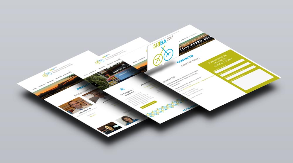
On a technical level, the website is developed in WordPress. It has a responsive design and it is oriented for the event registration, integrating an automatic system and online payment.
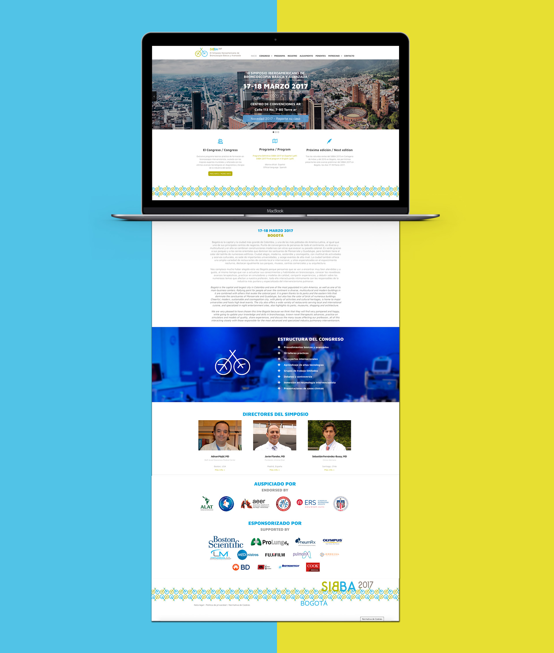
Brand adaptation to the congress’ graphic elements through frames that include the corporate colors.
