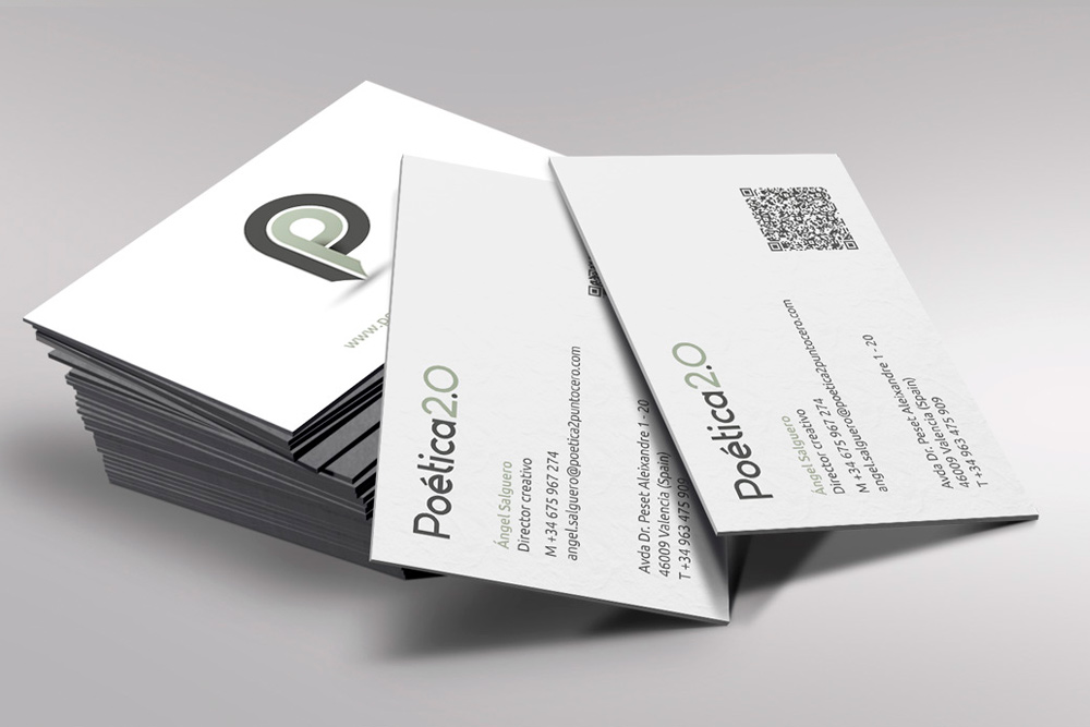
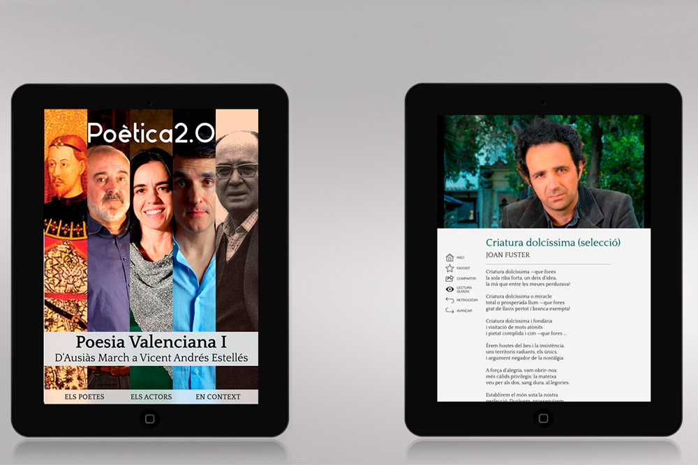
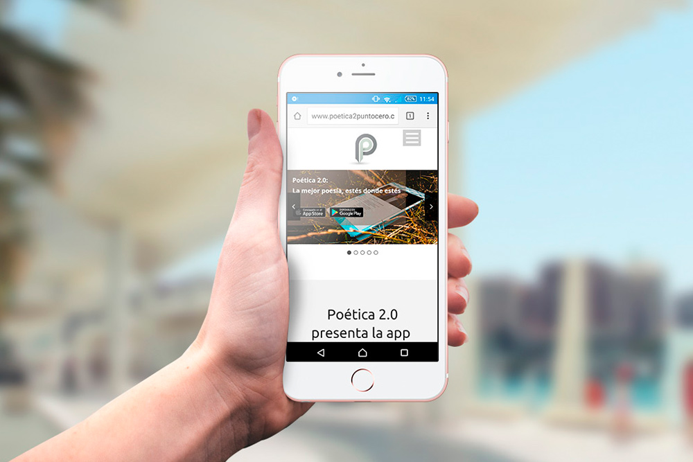
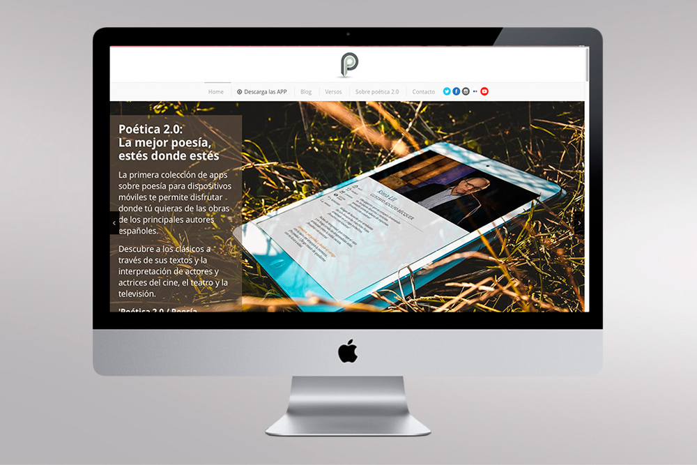
Poética 2.0 is the first collection of poetry apps for mobile devices and in äbranding we developed their website and their logo with its corresponding adaptations.
The website was created as a product web to encourage users to download the APP. It had to be very visual, and at the same time, it had to communicate the meaning of the application: intuitive, practical and full of interesting content. It had to give a lot of importance to the cultural references, who wanted to be part of this pioneering project, as they are well-known characters.
As for the logo, it was design as a sign spike, which forms the letter P of Poética. We played with different color variations for different authors and literary genres, to give to the identifying brand symbol more presence.


We gave a lot of importance to the cultural references, who wanted to be part of this pioneering project.
The website was created as a product web to encourage users to download the APP.


In äbranding we developed their website and their logo with its corresponding adaptations.