Monrabal, is a company in Valencia which manages the provision of electrical installations, maintenance and energy services and they counted on äbranding for their brand restyling. Our design team wanted to begin the transformation from the foundation of the brand, by starting with the logo restyling to create a more currant image, associated to their values: progress and innovation.
The symbol used for their logo was designed from the generation of the attachment points in the letter “m” of Monrabal, which were integrated into a red circle. In addition, the new symbol allowed connecting their areas of activity: construction, facilities, maintenance, management, engineering and consulting. At a chromatic level, the red corporate color was kept, and the initial black was softened by a gray.

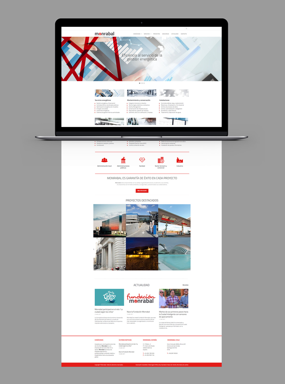
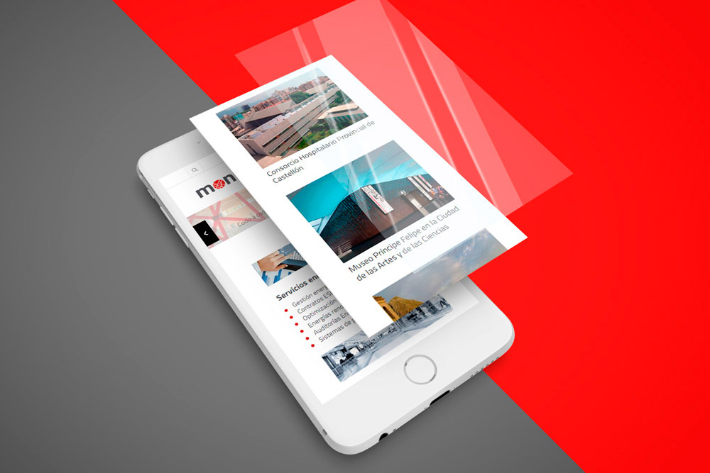
Based on the new brand identity, an ambitious project was designed that included the launch of a new corporate website.
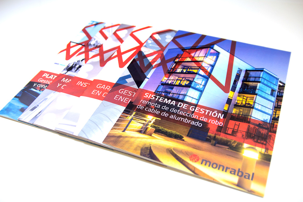
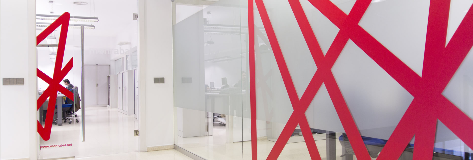
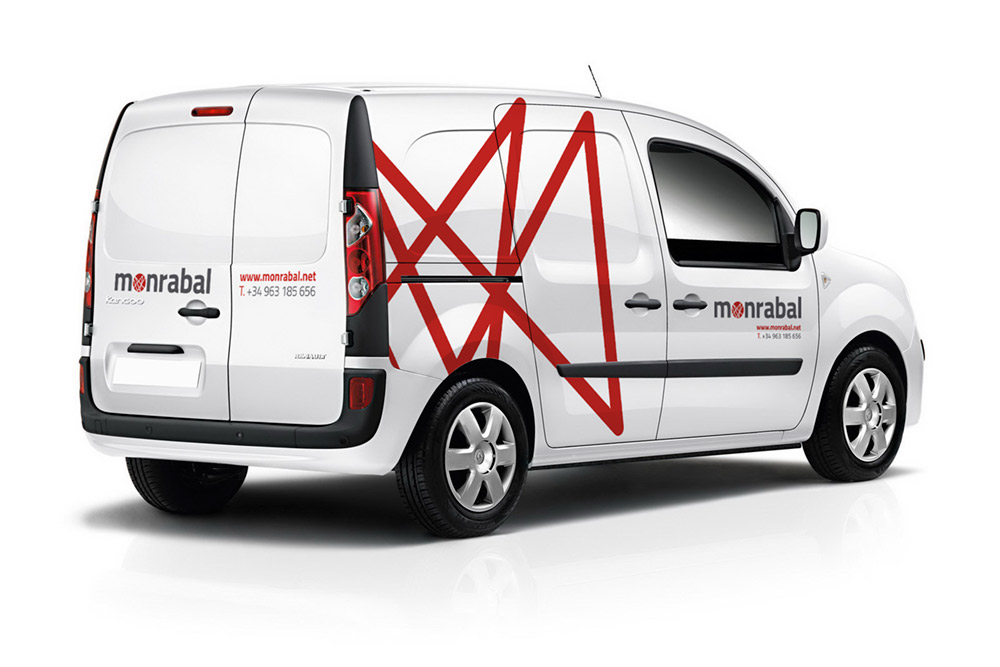
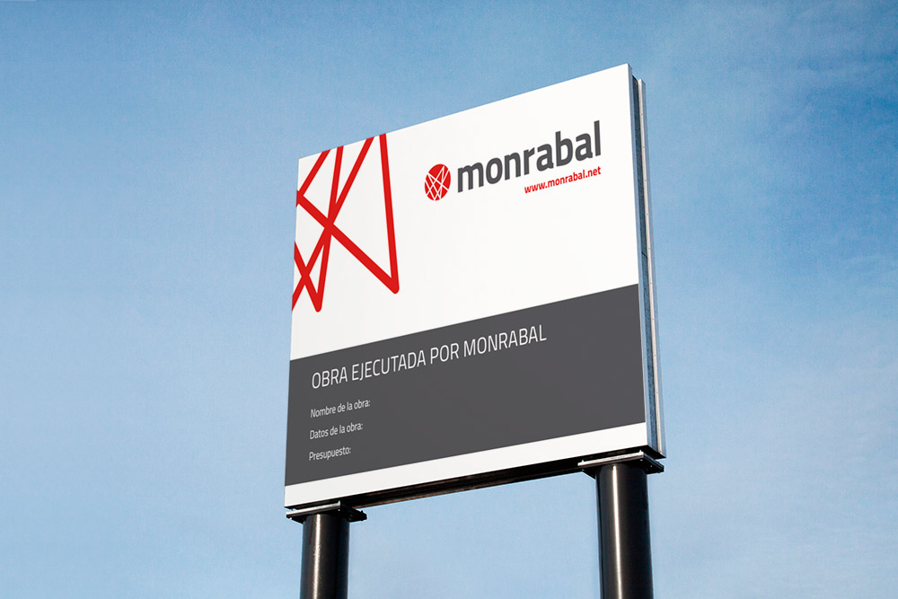
We also integrated the brand image in different internal media and sale elements, such us tarpaulins, service brochures, corporate clothing, corporate vehicle coating and office labeling, among other works.
