The combination of design, craftwork, custom and trendy luminaires are Bohéme Design´s specialty, the same company that proposed to äbranding their need to redesign its brand identity with presence both offline and online.
Their corporate brand must communicate the values of innovation and design, not forgetting the craftwork and manufacture in the design of each art piece. Therefore, based on its initial logo we decided to lengthen the non-serif typography, simple but effective, using the navy-blue color that transmits elegance and good taste. Their icon was redesigned giving it a bright silver touch with a premium connotation, so it can be used in graphic media that requires a special design and high-quality print.
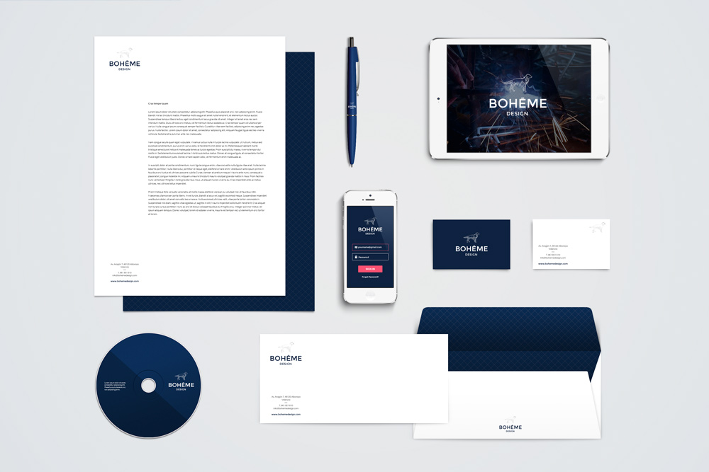
With this new corporate identity, we updated its different application for each corporate media, from graphic to digital elements, such as their product brochure and their website.
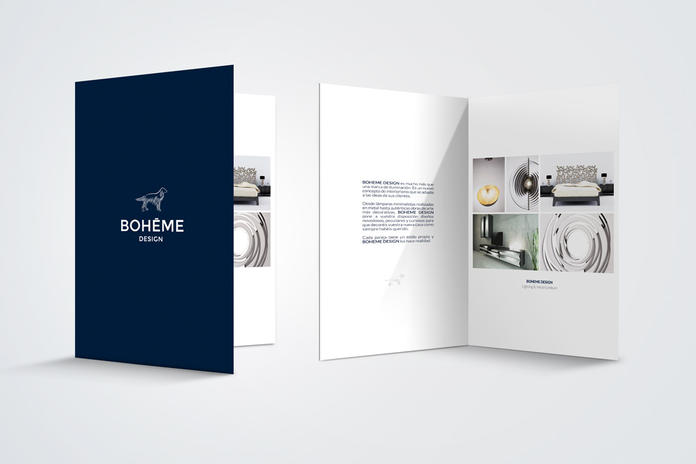
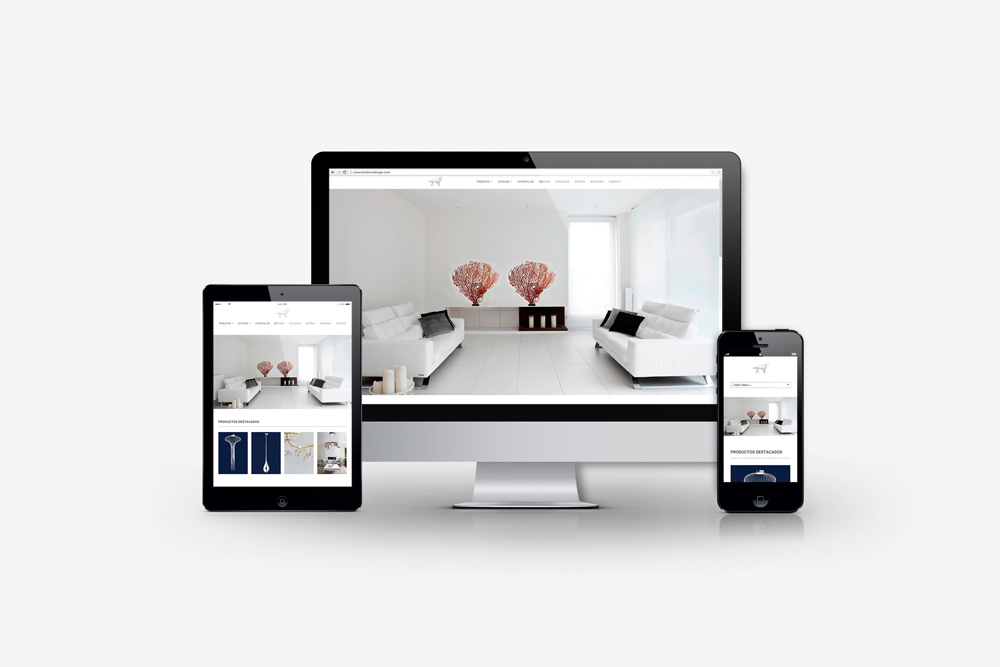
For the brochure called “L’élite Bleue”, we represented the elegance, distinction and craftwork of its luminaries. For the website, the goal was to include the digital version of the brochure, highlighting its added value. We proposed a full screen and responsive design, sophisticated and elegant. Furthermore, the pieces were merged in modern and innovational environments.
Finally, we designed Bohéme Design´s business card with their new brand identity, including their contact information as well and the new website.


A special design and a high-quality printing.
We updated the graphic elements that required a special design to aim a high-quality print.


We updated its different application for each corporate media, from graphic to digital elements.